The Troy Agency Website Creation Process
June 9, 2024
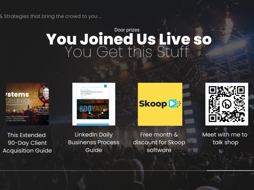
EVENT GIVEAWAY – Building Systems and Strategies that Bring the Crowd to You
February 4, 2025What is Skoop?
Imagine having the power to instantly send short videos, voice memos, and animated GIFs that convert conversations into clients—all within your LinkedIn DMs, posts, comments, emails, and more. That’s the vision behind Skoop. It’s a unique SaaS product, primarily designed as a Chrome extension, to create personalized connections on LinkedIn, Gmail, Microsoft 365, and almost any platform that supports a camera and microphone.
We built Skoop’s website and dashboard in just five days—yes, five days to transform it from “functional but a little ugly” to a polished platform. Here’s how we did it.
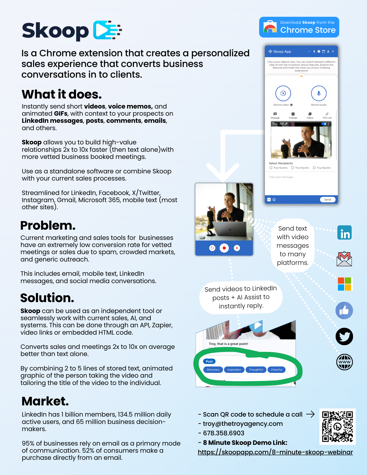
How did Skoop come to be? This section covers its development process, how it started, and how far it has come.
Skoop was developed by Troy Hipolito, the Owner and CEO of The Troy Agency. The Troy Agency works with B2B businesses to grow their brand, business, and bookings. In the course of business, Troy discovered a gap when connecting on LinkedIn. Many other entrepreneurs were using dm messaging to reach their audience. This tactic soon became obsolete since many other entrepreneurs were using messaging that started to sound very generic and templated. Troy figured out that video was the solution to connect genuinely and foster long-lasting relationships. Unfortunately, there was no easy way to send a video directly on LinkedIn using your PC.
Troy started developing Skoop with our in-house development team to fill this gap. Development took 3 months, and the software was launched in the Chrome Store as a Chrome Extension.
The software has grown to become very useful in creating valuable relationships and increasing revenue on LinkedIn and beyond.
Why We Needed a Quick Build
Dashboard Development: Where the Magic Happens
The website might be the public face of Skoop, but the dashboard is where the magic really happens. We built out an intuitive admin system, allowing us to manage features and communication directly with Skoop’s application. The dashboard includes:
- Complete Support System for user queries
- Affiliate Program Management to reward partners
- User Management and control over special codes for discounts
- Integration with AppSumo and, soon, Calendar Sync
- Version Control for easy updates and testing
Developing this dashboard was a balancing act between functionality and simplicity. We wanted it to feel robust for admins without overwhelming them.


Design Trials and Triumphs: Logo Creation
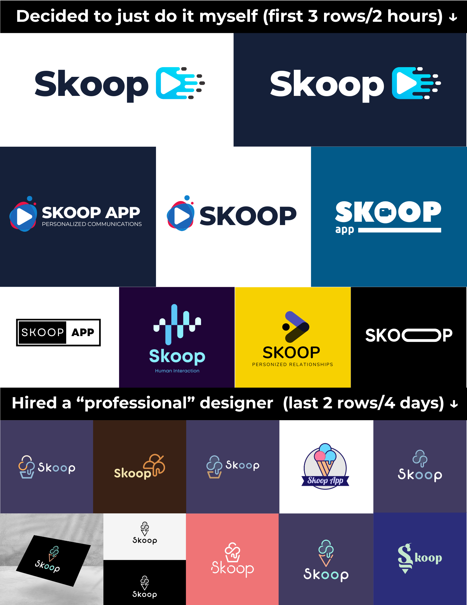
Ah, the logo. Designing Skoop’s logo was an adventure of its own. We originally hired a graphic designer with a decent portfolio, but the results? Let’s just say it felt more like a “first-year student” than a polished professional. It was clear they didn’t grasp the look and feel we wanted, so we parted ways, and I decided to handle it in-house.
The final logo design is clean and modern, aligning with Skoop’s brand image. In hindsight, the extra time and attention here made all the difference in creating a recognizable identity that feels authentic.

The Perks of Working with Ourselves as the Client
Working on Skoop as an internal project brought unique advantages. Unlike client projects, where delays are the norm (waiting on content, approvals, tech setup, etc.), our team could move fast. We skipped those common bottlenecks and turned a process that might’ve taken two months into a five-day sprint. Here’s why:
- We had all the content ready from Day 1.
- Visual elements and photos were prepared in advance.
- Approvals? Instantaneous. We’d decide, and boom—moving forward.
- No delays over minor tech issues or misplaced emails from “Billy the IT guy” (who sometimes “doesn’t know jack squat”).
With this momentum, our five-day timeline was not only possible but efficient.
The Final Product: 5 Days, a Polished SaaS Platform
In five days, Skoop’s website and dashboard went from “functional” to “ready to convert.” The new build is fast, stable, and designed for users to grasp Skoop’s core offerings quickly. By focusing on streamlined content, modern tech, and robust backend functionality, we’ve created a platform that’s both intuitive and impactful.
Skoop now empowers users with quick, personalized communication tools that convert interactions into meaningful relationships—whether that’s through short video messages, voice memos, or animated GIFs. We’ve built something that’s not only useful but exciting to use.
Try Skoop for Yourself
Skoop was built to help you connect in a more personal way. If you’re curious to see what a tool like this can do for your LinkedIn game (or any platform that supports video and voice), give Skoop a try. And don’t hesitate to reach out—we’d love to hear how it’s working for you!
Conclusion:
Skoop was developed with the user in mind; it’s a tool that helps you connect genuinely, build better relationships, and increase revenue. Download it and use it with LinkedIn, Gmail, and other platforms to add a new dimension of personalization to your communications. Imagine logging into LinkedIn and having a unique message ready—one that truly speaks to your connections, setting you apart from the flood of generic messages they receive daily. With Skoop, your outreach becomes more than just another connection request; it’s an opportunity to leave a lasting impression.
To get started, try using Skoop’s video messaging feature for an introductory message. Record a quick video and send it to a new or existing connection. This simple step can open doors to deeper conversations and business opportunities.
So go ahead—download Skoop, create your first video, and start building the relationships that drive success.
Watch these tutorial videos to help you get started:
Main Features of Skoop
Creating A Simple Video on LinkedIn
Creating A Welcome Video
Creating A Voice Memo
Adding An Animated GIF
Reusable Replies
Manage Your Videos And Media
Using Skoop's Booking Calendar
Sending Video via Email & Microsoft 360
How to Become An Affiliate
How to Add Videos And Voice Memos To Post Comments


1 Comment
This was a great read, very easy to digest.